 Hub
One look in every app
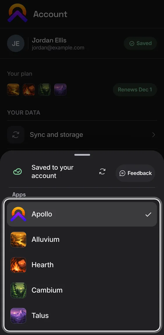
The apps share one set of parts, so they look and work alike: the header with the app's mark and its round buttons, flat sections of rows under small capital labels, round checkboxes, Phosphor icons, the same type sizes and corners. Rows open their item; the + always makes the tab's main thing. Each app keeps its own colour.
The Hub’s features play in its own demo, not on this page.
Every One look in every app feature
Every app has its own mark: on the home screen when installed, in the browser tab, in its header, in the app switcher and on the Hub.
- Install an app, or open the switcher from the mark at the top left.