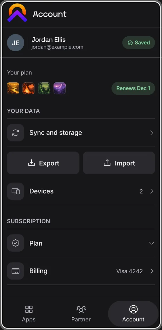
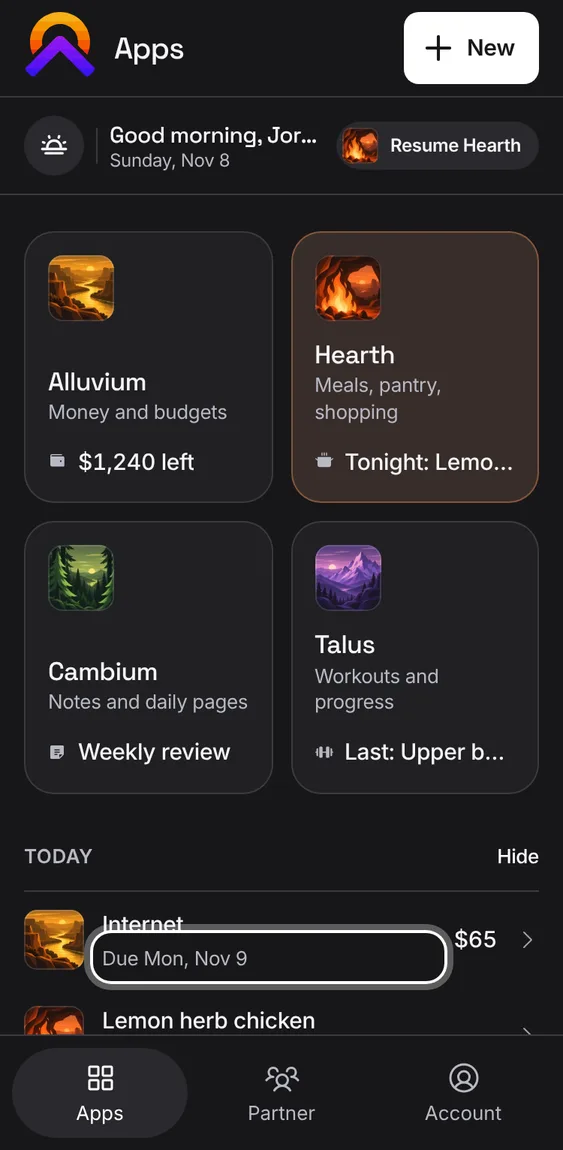
What Alluvium, Hearth, Cambium, Talus and the Hub all do the same way: how they look, how sheets close, how they read on a phone or a desktop, and how they keep your work and your data safe.
The Hub’s features play in its own demo, not on this page.
Every In every app feature
27
AI is part of every app: it sorts bank entries, tidies recipes, reads scans and recordings, suggests tags and finds notes by meaning. Its results are labelled and stay yours to edit. If AI is down or busy, the apps keep working by hand.
Nothing to turn on: AI works in the background on what you've saved.
Each person has a daily allowance; past it, or offline, the manual way is always there.
Not in the demo. Shows in Alluvium, Hearth, Cambium or Talus, not in the Hub.
Overview cards show a small line chart of your own figures with the current number on top and an honest trend: it compares like with like, says “so far” for a period still running, and invents nothing from a single point. Tap a card for the chart in full, with its legend and exact values.
Tap a card to open its detail.
A gap in the data breaks the line instead of dropping to zero; a trend is coloured only where up or down is clearly better.
Calendars such as Hearth's Plan and Cambium's Daily stand on their own, without a card above them.
Not in the demo. Shows in Alluvium, Hearth, Cambium or Talus, not in the Hub.
On a phone, chart cards drift a few pixels as you tilt it, so they feel a little alive. It never asks for permission, never uses the camera, and stays still with reduced motion.
Tilt your phone while looking at a chart card. Nothing to turn on; there is no control for it.
Not in the demo. Shows in Alluvium, Hearth, Cambium or Talus, not in the Hub.
Every app, page, demo and sheet is dark, with text and figures kept readable against it. Headers and menus are solid, so nothing shows through them as you scroll.
There is no light mode to choose. An old Light or System setting on a device still opens dark, even before the page has finished loading.
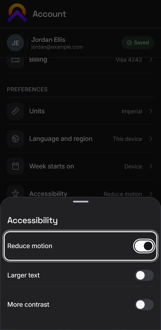
Account › Preferences › Accessibility › More contrast strengthens it further.
Dates, durations, counts and amounts are written the same way in every app: Today, Yesterday or the weekday for the past week, “1 h” rather than “1 h 0 min”, “1 cup” rather than “1 cups”, and a true minus sign on money. Days follow your time zone and your week's first day, and lists sort the same on every device.
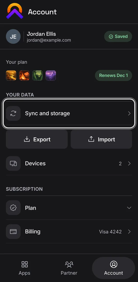
Account › Preferences › Language and region and Week starts on set how they read.
Calendars always run older on the left, newer on the right; a day's dot or bar says its state in words to a screen reader.
Unsaved work is kept on your device as you type, through Back, a reload, an update or a failed save, until you save it or choose to discard it.
Close an editor with changes: Back asks before discarding, and you can cancel.
Unfinished work waits with Resume.
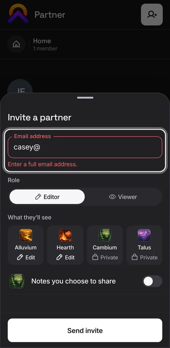
Every field has its label on its outline and shows its error right beside it. Money fields group the digits and ask for the number pad; pickers say what they hold.
Tap a field to type; a picker field opens its list. An error stays at the field with what you typed kept.
When you change a search or a date range quickly, an older answer arriving late never replaces the newer one.
Type a search, change a forecast's range or a shopping list's dates: what you see always matches your latest choice.
Everything works from a keyboard: Tab moves through each control once, Escape closes the top sheet, and closing puts you back where you were.
Tab to move, Enter or Space to press, Escape to close.
A grid of colours or icons is one Tab stop; the arrow keys choose within it.
With a mouse or trackpad, a search field is ready to type into as it opens.
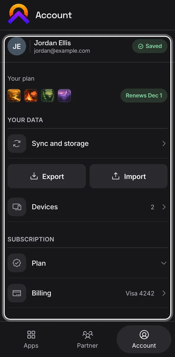
Each app is laid out for a phone first, from 320px wide, and adapts to a tablet and a desktop window, where a list and its item sit side by side. Spacing is even, nothing runs off the edge, the top bar stays on one line, and no fact is cut short.
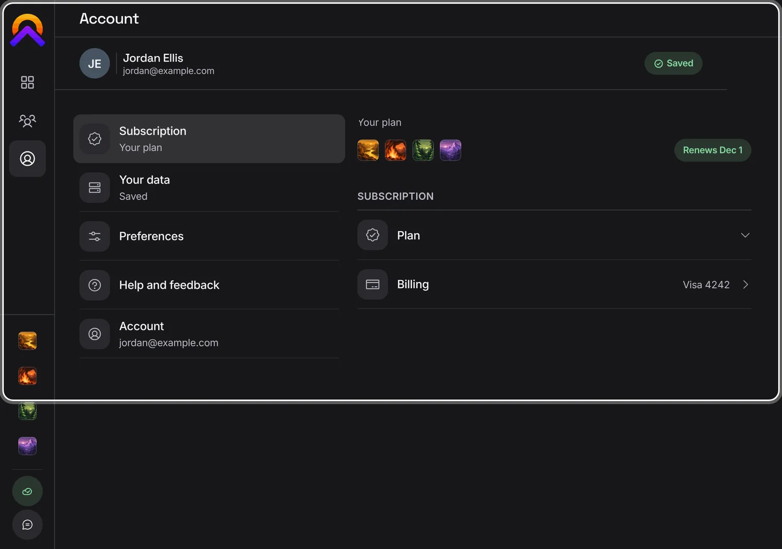
From 1024px wide, a desktop window uses the tablet's landscape layout: a rail of tabs on the left and the page in a column.
Everything on a page is within one tap; content ends clear of the bottom bar.
Shown at a computer’s width.
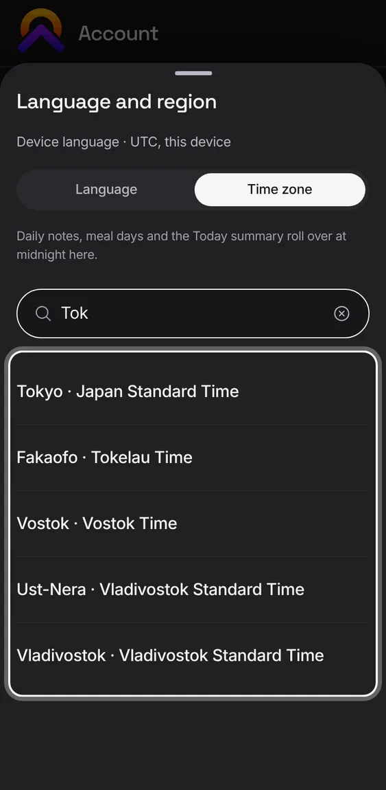
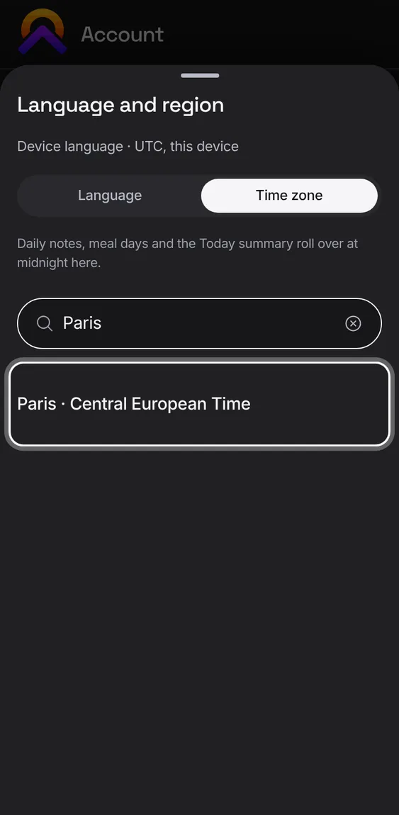
Choosing from a long list (a bucket, a payee, an exercise, an icon) is a search with rows, not a wall of chips. Your recent choices come first, and the current one is ticked once.
Start typing: names that start with your words come first; case and accents don't matter.
The icon picker searches the whole Phosphor library by its own words, so “dining” finds the fork and knife.
A row of chips scrolls the chosen one into view.
With reduced motion on, nothing slides, pulses or drifts: sheets appear in place, loading rows stand still and charts don't tilt.
Account › Preferences › Accessibility › Reduce motion, or your device's own setting.
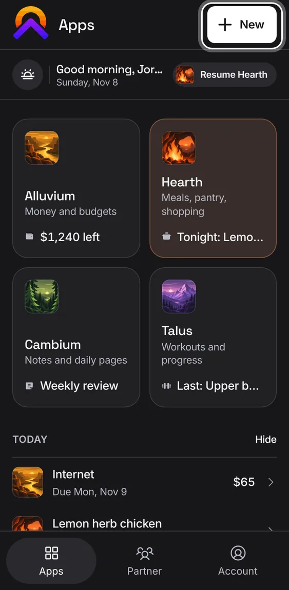
The apps share one set of parts, so they look and work alike: the header with the app's mark and its round buttons, flat sections of rows under small capital labels, round checkboxes, Phosphor icons, the same type sizes and corners. Rows open their item; the + always makes the tab's main thing. Each app keeps its own colour.
Tap a row to open it; its edits and Delete are inside, never a row of buttons.
Long lists show five rows, then All; the destructive choice is always last.
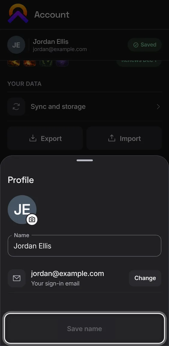
A person without a photo shows their initials in a neutral colour.
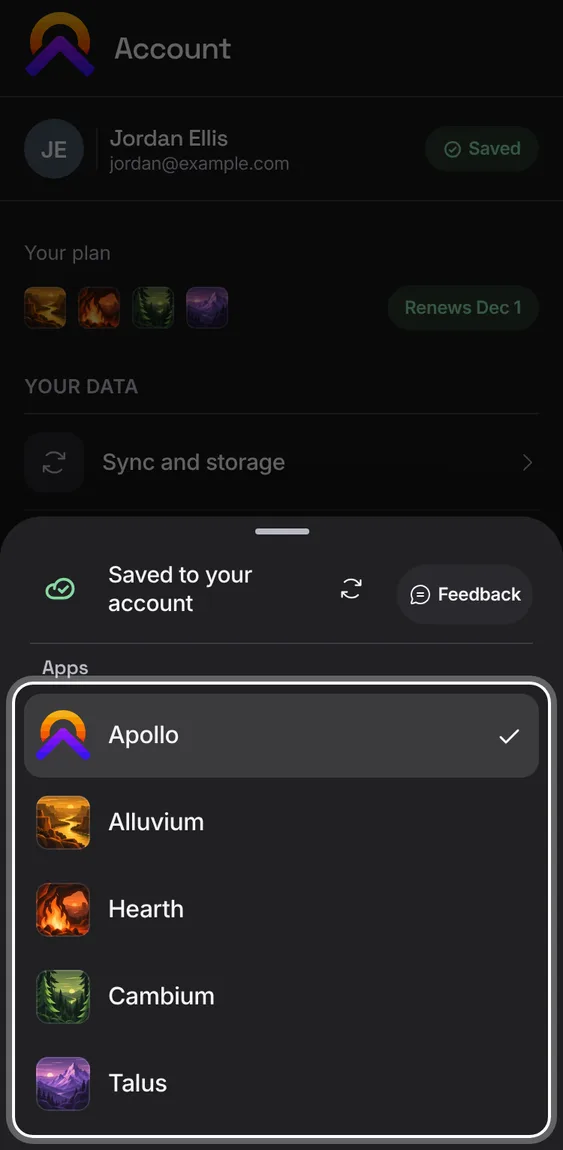
Every app has its own mark: on the home screen when installed, in the browser tab, in its header, in the app switcher and on the Hub.
Install an app, or open the switcher from the mark at the top left.
A short outage at the bank link or at Stripe doesn't break anything: a bank connection stays connected and is retried later, a payment event is counted once, and a large first bank sync saves in steps so it can pick up where it stopped.
Nothing to do. You can keep adding entries by hand while a connection catches up.
Not in the demo. Asks Apollo’s server, which the tour site doesn’t reach.
When the keyboard opens, the field you tapped moves to the middle of what's left, and a sheet's Save and a workout's buttons stay in view above it. Nothing shows under a sheet, and a message that pops up sits just above the keyboard.
Tap a field low in a sheet or a line low in a note: it moves into place at your tap, and stays put once the keyboard is up.
Not in the demo. Needs a phone’s own keyboard.
Recipe photos, payee logos and pictures in notes are fetched once, made smaller and kept on your device, so they show after a reload and offline. Pictures from another account never show in yours.
Add a picture or a link to one; it's saved on this device and shown from there.
Pictures from the web are fetched safely: only public HTTPS images, never private addresses, with a time limit.
Not in the demo. Shows in Alluvium, Hearth, Cambium or Talus, not in the Hub.
The server checks who you are on every request, keeps bank and store sign-ins encrypted on its side, and never lets another site act for you. Deleting something needs a fresh, one-time proof.
Nothing to do: it applies to every app and every request.
Not in the demo. Asks Apollo’s server, which the tour site doesn’t reach.
Cook mode and a workout open full screen and keep your phone's screen on, with no switch to remember. Minimise the workout and the screen can sleep again.
Start cooking in Hearth or start a workout in Talus.
Their settings button opens the few switches they have; the down arrow minimises without stopping anything.
Not in the demo. Shows in Alluvium, Hearth, Cambium or Talus, not in the Hub.
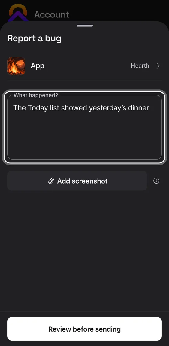
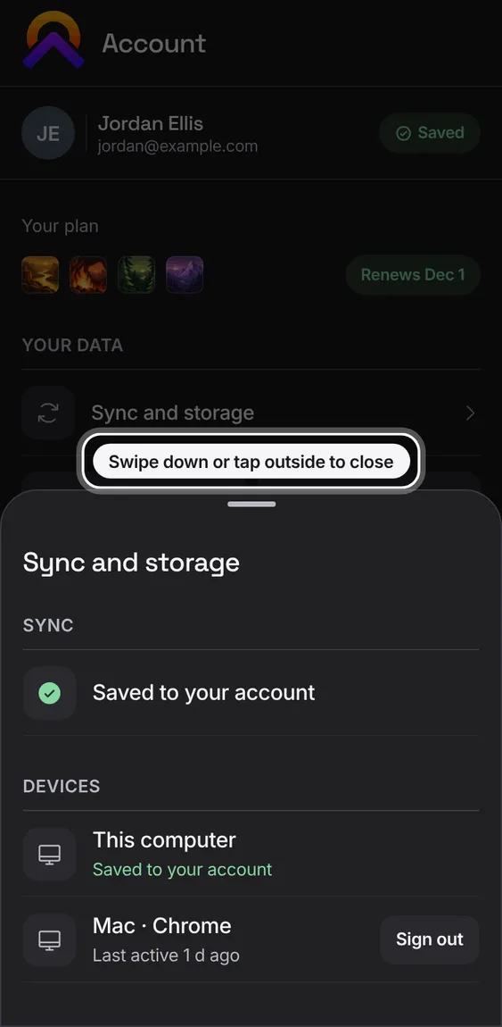
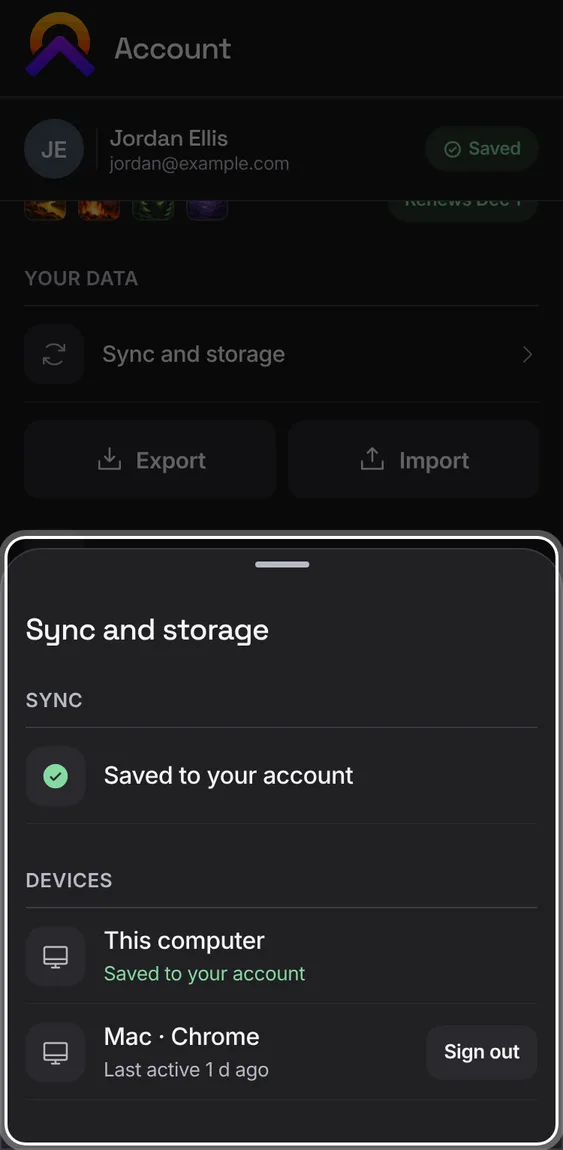
Editors and choices slide up as sheets. A sheet has no X: tap outside it, press Back or Escape, or pull it down to close it. While it's open, nothing behind it can be tapped or scrolled.
Pull a sheet down: a short or paused pull springs back, a committed pull closes it.
Only the top sheet closes; a confirmation tapped outside cancels without doing anything.
With a keyboard or screen reader, a sheet has a Close button that returns you to where you were.
A sheet sits below the phone's status bar and above the app's header, and its Save stays clear of the iPhone's home bar.
The first sheet you open shows a short tip above it, “Swipe down or tap outside to close”. It goes by itself and never shows again on that device.
Open any sheet on a phone for the first time. From 600px wide a sheet is a centred dialog and shows no tip.
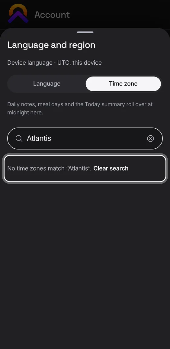
Every app says the same things the same way while it works: a quiet placeholder while searching, “No results” with Clear search, a read that failed with Try again, and a small mark that turns from a ring to “Saved”. What you typed is kept when something fails.
Search: results show as soon as the first arrive; “No results” only once every source has answered.
When something can't load, Try again sits beside the message.
Go to another tab and back, and the one you left is as it was: scrolled to the same spot, pictures already showing. A note's list stays put behind an open note.
Switch tabs freely; the page's tools follow the tab you can see.
Every button is big enough for a finger and reacts as you press it. A tap while a list is still gliding presses what you tapped, once, and a tap on a list that's opening never falls through to what's behind it.
Tap a button while the page is still scrolling: it presses once, unless you keep scrolling.
In a drop-down list, a tapped option chooses; a tap outside closes only the list.
Text can grow to twice its size and every app still fits: headings and the tab bar grow with it, and a crowded header drops words before anything is cut. Fields are big enough that an iPhone never zooms in on them.
Account › Preferences › Accessibility › Larger text, or your phone's own text size.
When the title no longer fits, the header first drops the words beside its tools, then tightens, then shrinks the +.
The same words mean the same thing in every app: a new thing is “New recipe” and its button “Add recipe”, an edit ends in “Save routine”, a picker asks you to “Choose a category”. Labels are short and written with proper apostrophes.
A button names what it does and to what: Save bucket, Start workout, Delete recipe; never a bare Save.
Visible text stays short; longer explanations live in the legal pages and the blog.
A page's main tools show a word beside their icon, so you don't have to guess. On a very narrow screen they fall back to round icons, still named for screen readers.
In a crowded header only the main tools get words; Share stays an icon.
Below 360px wide, or where a bar would wrap, the words drop back to icons.
Every icon-only button is named, and a feature never hides behind a bare icon on a phone.
 Hub